Saturday, April 18, 2009

Index value plot


An index value plot is another type of visualization map. An index value is plotted on a line graph. This map shows the average steam flow in the US from 1999 to 2008. Its shown on a previously made graph to show how relative the steam flow was. It shows that it was normal.

http://water.usgs.gov/waterwatch/regplots/real/real_us_2.gif

Population profile


Population profile maps present a graphic overview of several demographic statistics. In the diagram, the male & female populations in Mobile County in 1998 are shown. The different ages are also shown in different groups.

http://camellia.shc.edu/literacy/tablesversion/assignments/Image2.jpg

Friday, April 17, 2009

Triangular plot


A triangular plot is a plot on three variables, which sum to a constant. The axes of the figure show the estimated fraction of the population intending to vote for each of the major parties; the white circle shows the current estimate from opinion polls. The colored areas show the regions of the plot in which -- under the assumption of uniform national swing -- each of the corresponding major parties would win a majority in Parliament.

http://ex-parrot.com/~chris/wwwitter/20050407-it_doesnt_matter_how_you_vote_either_way_your_planet_is_doomed.html

Climograph


A climograph is a type of geovisualization. It is a graphic representation of the relation between temperature and precipitation as plotted at monthly intervals throughout the year. This image shows us the Wet-Dry Tropical / Tropical Savanna climate: Timbo, Guinea, at lat. 10N, West Africa. Looking at the map, we can see that a wet season at time of high sun alternates with an almost rainless dry season at time of low sun.

http://www.sci.uidaho.edu/scripter/geog100/lect/06-climates/low-lat-climates/7-12-tropical-wet-dry-climograph.htm

Thursday, April 16, 2009

parallel coordinate graph


A parallel coordinate graph is used to plot large multivariate datasets. Each Y Axis is labled with a particular baseball statistic The value labled at the top of each Y axis represents the player with the highest value in that category. Each line drawn represents a single player. More precisely, a line is represented by the values of each of a player's statistics.

http://www.matthewtavares.com/baseball_report/

Wednesday, April 15, 2009

Lorenz Curve


A Lorenz Curve is used in statistics to portray items such as wealth and income. This particular Lorenz Curve portrays the percentage of income against the percentage of households' actual income.

http://content.answers.com/main/content/wp/en/b/bd/Lorenz-curve1.png

Tuesday, April 14, 2009

Bi-lateral Graph


A bi-lateral graph is a visualization map. Two related variables are identified as well as their overlaps. This map represents bilateral humanitarian assistance from various countries.

http://www.globalhumanitarianassistance.org/New%20Images/Growth%20in%20bilateral%20humanitarian%20assistance%202005-2006%20copy.jpg

Wind rose


A wind rose is a map diagram that summarizes information about the wind at a particular location over a specified time period. This diagram shows the wind speeds in Seattle, Washington. From the lack of aqua color in the diagram, one can tell that there are no winds greater than 21 knots.

http://www.climate.washington.edu/windrose/Seattle-WindRose.jpg

Monday, April 13, 2009

LIDAR


LIDAR (Light Detection and Ranging) is an optical remote sensing technology that measures properties of scattered light to find range and/or other information of a distant target. LIDAR produces a highly accurate depiction of the forest floor and tree heights.

http://www.treehugger.com/files/2007/06/3-d_forest_mapping.php

Sunday, April 12, 2009

Standardized choropleth maps

Data in choropleth maps are standardized to allow comparison of distribution among different areas. Here is a map of Canada displaying the different area's population of people age 14 and under.

http://www.statcan.ca/english/research/92F0138MIE/2008003/figures/figure3.1-en.jpg

Univariate choropleth


A univariate choropleth map displays a single data set. Here only one set of data is displayed regarding poverty in the United States.

http://www.cdc.gov/pcd/issues/2007/oct/images/07_0091_02.gif

Scatter plot


Scatter plots are similar to line graphs in that they use horizontal and vertical axes to plot data points. However, they have a very specific purpose. Scatter plots show how much one variable is affected by another. Waiting time between eruptions and the duration of the eruption for the Old Faithful geyser in Yellowstone National Park, Wyoming, USA. This chart suggests there are generally two "types" of eruptions: short-wait-short-duration, and long-wait-long-duration.

http://en.wikipedia.org/wiki/File:Oldfaithful3.png

Friday, April 10, 2009

Isoline


An isoline on a map is line connecting points of equal value. This map shows the different weather lines across the US. Southern California, New Mexico, Florida & Texas all have more or less the same hot, humid temperature.

http://indiemaps.com/blog/2008/06/isolining-package-for-actionscript-3/

Tuesday, March 31, 2009

Black and white aerial photo


This black and white satellite image shows Alaska's Mount Redoubt volcano as it emits a steady ash plume. The volcano 100 miles southwest of Anchorage has erupted 18 times since March 22, 2009 sending ash in various directions.

http://www.examiner.com/x-219-Denver-Weather-Examiner~y2009m4d4-Mount-Redoubt-erupts-again-sending-ash-and-smoke-50000-feet-into-the-air?cid=exrss-Denver-Weather-Examiner

Friday, March 27, 2009

Nominal area choropleth map


Also known as a descriptive map this nominal area choropleth map provides geographical information about Canada's vegetation. The variation in color is associated with qualitative differences.

http://atlas.nrcan.gc.ca/site/english/learningresources/carto_corner/veget.jpg

Wednesday, March 25, 2009

Histogram


A histogram is a graphical display of tabulated frequencies, shown as bars. The histogram shown here includes the standard deviation and mean.

http://yrs.sonikson.net/terms/histogram.php

Box plot


A box plot is a convenient way of graphically depicting groups of numerical data through their five-number summaries (the smallest observation, lower quartile, median, upper quartile, and largest observation).

www.epa.gov/volunteer/stream/vms62.html

Saturday, March 21, 2009

Stem-and-Leaf Plot


A stem-and-leaf plot is a display that organizes data to show its shape and distribution. This picture would be a good example, except the new housing starts in the USA could be described as skewed to the right because the higher values are more spread out than the lower values.

http://www.uow.edu.au/student/attributes/statlit/modules/module2/shapedist.html

Wednesday, March 18, 2009

Correlation matrix


A correlation matrix shows the strength and direction of a linear relationship between two random variables. This matrix is a calculated protein correlation matrix for phage T7. Correlated behavior ranges from high(red) to low(blue), and the triangular block of red reflects proteins involved in phage assembly, a highly coordinated process.

http://yin.che.wisc.edu/images/ProteinMatrix.jpg

Tuesday, March 17, 2009

Star Plot


A star plot is a graphical data analysis method used for examining the relative behavior of all variables in a multivariate data set. This is an example of a star plot from NASA, with in the center the some most desirable design results represented.

http://upload.wikimedia.org/wikipedia/commons/0/09/MER_Star_Plot.gif

Monday, March 16, 2009

Similarity matrix


A similarity matrix is a matrix of scores which express the similarity between two data points. They are generally used in sequence alignment. The higher the score the more similar charachters it receives.

http://tomcat.esat.kuleuven.be/txtgate/images/distmat.png

DRG


Digital Raster Graphics (DRGs) are scanned images of U.S. Geological Survey (USGS) topographic maps. The scanned image includes all standard map collar information.
When the DRG is combined with other digital products, such as digital orthophoto quarter quadrangles (DOQQs), or digital elevation models (DEMs), the resulting image provides additional visual information for the extraction and revision of base cartographic information.

http://www.tceq.state.tx.us/gis/drg.html

Sunday, March 15, 2009

Isopach


An isopach is a contour that connects points of equal thickness. The rainbow contours correspond to thickness of sediment on the ocean floor and the increasingly pink colors represent greater sediment thickness. The brown to red seep gas plume contours were generated from the August, 1996 sonar survey.

http://seeps.geol.ucsb.edu/pages/isopach.html

Saturday, March 14, 2009

Isotach


Isotachs are lines of equal wind speed. They are most often contoured in the upper levels of the atmosphere, especially at the jet stream level. They are important for locating the jet stream and jet streaks within a jet stream. The green lines in the photo are the isotach lines, showing the different wind speeds along the latitudes of the US.

http://www.comet.ucar.edu/resources/cases/c2_06dec95/gif/250ht_isotach.gif

Thursday, March 12, 2009

Doppler radar


A doppler radar is a radar using the doppler effect of the returned echoes from targets to measure their radial velocity. In this map, the doppler radar shows where there will be rain in the area. The bits of yellow are much heavier rain.

http://www.bom.gov.au/weather/radar/about/new_radar_services.shtml

Tuesday, March 10, 2009

Infrared aerial photo


An infrared photo can be used to document and monitor such items as damage to roofs, the tracking of dairy farm out flows, pinpointing the source of, and monitoring, insect or disease infested vineyards, or sites contaminated by toxic chemicals, and many more applications. In this photo, the red and yellow show Hurricane Andrew as it hit Miami. The yellow bands around the hurricane are wind and rain bands.

http://www.srh.noaa.gov/mfl/events/?id=andrew

Thursday, February 26, 2009

Cartogram


A cartogram is a map in which some thematic mapping variable – such as travel time or Gross National Product – is substituted for land area. The geometry or space of the map is distorted in order to convey the information of this alternate variable. There are two main types of cartograms: area and distance cartograms. This cartogram shows Open Europe estimate of total European Union net budget expenditure in euros for the whole period 2007-2013 per capita, based on Eurostat 2007 population estimates.

http://en.wikipedia.org/wiki/File:EU_net_budget_2007-2013_per_capita_cartogram.png

Wednesday, February 25, 2009


A statistical map gives a standard statistic of the functional time course over a specified set of periods. This map shows the percentage increase in Internet usage in Africa in the mid 1990’s. The red bars show places where usage has decreased, while light purple shows new usage and aqua shows a high percentage of usage.

http://personalpages.manchester.ac.uk/staff/m.dodge/cybergeography/atlas/census.html

Flow map


Flow maps are a mix of maps and flow charts, that show the movement of objects from one location to another, such as the number of people in a migration, the amount of goods being traded, or the number of packets in a network. In this map, showing the tracking of the West Nile Virus, the virus was tracked back to originating in the Michigan area and is the highest state due to the higher number of confirmed cases. Following the map outward form the Mississippi River, the colors show their proximity to the river while their height shows the number of confirmed cases.

http://www.mpassociates.gr/software/distrib/science/golden/mapviewer7.html

Monday, February 23, 2009

Choropleth map


A choropleth map is a thematic map in which areas are shaded or patterned in proportion to the measurement of the statistical variable being displayed on the map, such as population density or per-capita income. This map shows the different margins of victory during the 2002 US elections. The red states and all shades of red are the republican states and the blue states and all shades of blue are the democratic states. The different percentages are expressed as different shades of the principle color.

http://en.wikipedia.org/wiki/File:2004US_election_map.svg

Sunday, February 22, 2009

Dot distribution map


Dot distribution maps are used to show populations. In this map it shows the distribution of vascular plants in Europe. The red, orange, & yellow dots show a higher concentration of vascular plants, primarily in southwestern Europe.

www.biologie.uni-hamburg.de/.../IDB/afe.html

Saturday, February 21, 2009

Hypsometric map


Hypsometric maps represent the elevation of the terrain with colors. The area between two neighboring contour lines receives one specific tint. In this map of Tajikistan, the darker the color the higher the elevation.

http://www.rrcap.unep.org/centralasia/reapreport/map.cfm

Friday, February 20, 2009

Propaganda map


Propaganda maps are used to persuade people to think one way or another. This map of Europe was used by the government (pre-Nazis) to show the military how to see agricultural production in terms of a battle of production between Germany and the rest of Europe and between German farmers.

http://comenius.susqu.edu/hist/390/w2/Papers/Research/researchvanorden.htm

Bivariate choropleth map


Bivariate choropleth maps display two different variables displayed on one map by including two different sets of graphic symbols or colors. Here is a map depicting Olympic athletes.

http://www.directionsmag.com/images/articles/sportsillustrated/Olympic_Athletes.jpg

Thursday, February 19, 2009

PLSS map


PLSS (Public Land Survey System) maps are used to divide up public lands which are owned by the Federal Government. These are created to help the citizens of the United States. Since these surveys were completed many changes have occured in regards to public lands being now privately owned and vice versa.

http://gis.nwcg.gov/giss_2006/job_aids/maps_and_graphics/USA_PLSS_Meridians_map.jpg

Tuesday, February 17, 2009

Unstandardized choropleth


Unstandardized choropleth maps utilize raw numbers when displayed. In the map displayed the data displayed is not averaged.
http://www.smri.nl/gfx/ajp2002graph.gif

Saturday, February 14, 2009

Unclassed choropleth maps


This technique assigns shadings proportional to the data values so that these choropleth maps do not have to classify the data. This method of mapping has not been generally accepted because many cartographers claim that they lose the ability to direct the message of communication.

http://www.agocg.ac.uk/reports/visual/casestud/dykes/figure11.gif

Wednesday, February 11, 2009

Classed Choropleth Map


A classed choropleth map uses colors and shading to prove the specific data on the map. This map shows the spending by overseas residents in millions. Each color shade stands for a specific amount group.
http://www.neighbourhood.statistics.gov.uk/dissemination/Info.do?page=userguide/detailedguidance/statisticalpresentation/statisticalmaps/best-practice-statistical-maps.html

Tuesday, February 10, 2009

range graded proportional circle map


A range graded proportional circle map is a proportional circle map that depicts the circles in relation to ranges of data. The information is classified as equal quantities, breaks, natural breaks,
and minimum variance.

http://pubs.usgs.gov/fs/fs-004-03/

Thursday, January 29, 2009

Proportional circle map


Proportional circle maps display data in relation to the size of the circles. In this map data is displayed of internet users in Europe.

http://jeffhobbs.files.wordpress.com/2008/03/1.gif

Sunday, January 25, 2009

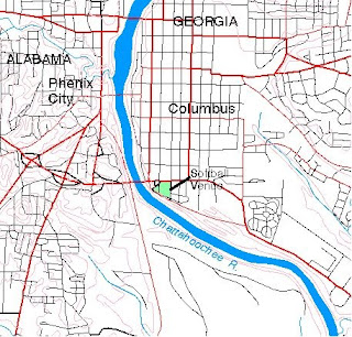
DLG


This map was made using Digital Line Graph (DLG) data. DLGs portray the linear information contained on the USGS topographic maps, such as transportation networks, hydrography, boundaries, elevation contours, and manmade features.

http://ga.water.usgs.gov/olympics/columbus.html

Thursday, January 22, 2009

DEM


This high-resolution digital elevation model, or DEM, for the area around Virginia Beach, Va., designed to improve forecasting for early tsunami warning systems and to help coastal communities prepare for storm-driven flooding. The DEM is constructed from near-shore seafloor depth and land elevation data to create a detailed representation of coastal relief.

http://www.noaanews.noaa.gov/stories2007/s2804.htm

Wednesday, January 21, 2009

Isohyet


Isohyets show average annual rainfall (mm) for stations with more than 20 years of records.

http://www.dpi.nsw.gov.au/agriculture/field/pastures-_and_-rangelands/establishment/clover/part-f---choosing-the-right-sub-clover-v

Tuesday, January 20, 2009

Planimetric Map


A planimetric map is a representation of the horizontal positions of features. It is like an inverse topographic map, which shows the vertical positions. This map of the world 300 million years ago shows the land masses but not the elevation or landscape.

www.geocraft.com/.../Penn_planimetric_map.html

Isobars


The isobars (black lines) on this weather map of Europe and the Mediterranean show the barometric pressure in hectopascals.

http://german.about.com/library/bldwetter_iso01.htm

Isopleths


This is an isopleth map of Hydrogen Ion concentration in the United States in 2003. It shows that there is more Hydrogen Ion concentration in the western part of the United States, and the least amount in the North East.

http://nadp.sws.uiuc.edu/isopleths/maps2003/phfield.gif

Monday, January 19, 2009

Thematic map


Thematic maps display bivariated information such as the soil moisture levels in the United States. Each color represents a different known ‘regime’ and therefore has different characteristics.

soils.usda.gov/use/thematic/moist_regimes.html

Topographic Map


A topographic map shows quantative landscaping information through the use of contour lines. This map is useful because it also shows natural and man made resources such as bodies of water in the surrounding areas or mineral deposits, which is useful for strategical or landscape planning. The different colors and different shades of each color show how deep the water is and how high the mountains are in Albania.

http://maps.grida.no/go/graphic/albania_topographic_map

Sunday, January 18, 2009

cadastral map


A cadastral map shows color-coded boundaries for each district on the map. This type of map is used mostly to determine land or parcel ownership but in this particular instance it is being used for boundaries. The cadastral map shows the lots and their designated numbers in the Alameda Park development.

alamedahistory.org/the-map/

Thursday, January 15, 2009

Cartographic Animation


This is a cartographic animation of Hurricane Katrina approaching Louisiana. This cartographic animation makes it easy to read the hurricane and examine the eye. Because the eye of the hurricane is so important to study, this animation makes determining the severity available to people.

http://www1.ncdc.noaa.gov/pub/data/nexradviewer/katrina/klix-landfall-anim_med.gif